We use cookies to enhance your experience, for more information, please visit our privacy policy.
By clicking “Accept”, you agree to the use of cookies to collect information about visits to our website.
By clicking "Reject non-essential", we'll respect your choice and limit cookies to fundamental site features.


for over 40 years we've been ahead of the curve when it comes to understanding how public transport is presented, perceived and promoted, we call it . . .
select a picture to find out more

leading light
The ambitious and entrepreneurial team behind Lumo were eager to build on their high-impact brand launch by adding depth to the vision - that's where we came in.
We worked closely with the team to sharpen clear messaging on things like luggage allowance and stowage, the changing onboard food and drink offers, clearer and better-focused labelling, and special promotions and events. We designed a refreshed user experience for Lumo's website, leading to increased ticket sales and allowing customers to get the information they need faster.
We've even worked some magic on the trains with exterior brand messaging and the entire fleet is getting a bespoke, better-wearing, stylish moquette we designed.


signature on the Mersey
Promising a bold and bright future for bus travel across Liverpool City Region, Metro wanted to make a big splash with an ambitious livery and interior scheme to define a new era of bus travel, and we couldn't resist the challenge.
Our almost brazen yellow, charcoal and black moquette, teamed with bright two-tone yellow leather headrests are a statement that celebrates the passenger experience - while each vehicle features stringer panel murals and a unique frieze that immerses passengers in a visual feast that celebrates the region's signature locales.
The onboard displays don't just have a sharp new look, we've designed them to show train connections just as you approach the stop. How's that for timing?
It's a new era for bus travel, and we can't wait for you to try it.


beauty in data
Software can be complicated, and even more so if trains are involved. We were approached to help simplify and explain Mistral Data's products in a fun and engaging fashion to clients in the rail industry and beyond.
Using our own deep industry knowledge with help from the excellent people at Mistral Data, we created unique infographics to explain how each product benefits train passengers and operators.
The engaging graphics were then rolled out to a refreshed website and the rest of the company's marketing.

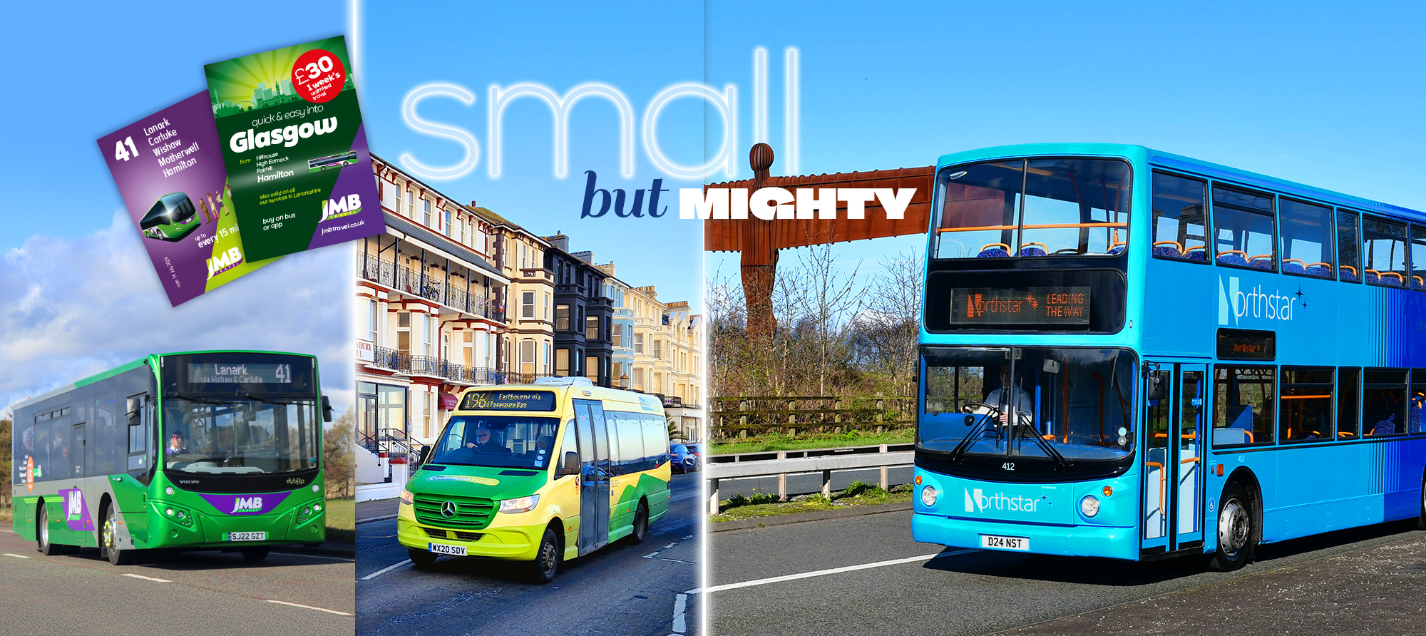
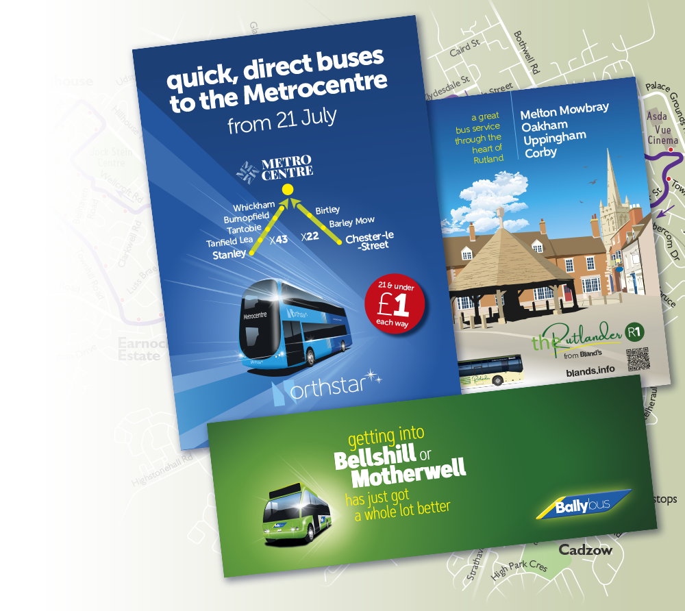
small but mighty
Big budget, small budget... we like to help any public transport provider or supporter that wants to make their offering appealing, desirable, fabulous. We have assisted a number of fledgling, small and community operators up their game and make the best impression with their customers, but also their stakeholders.
For example, we have done some high-profile branding and promotion for Bland’s to promote its upgraded R1 route that we renamed the Rutlander. We also helped get Northstar off the ground in the North East with a smart contemporary look and support in promoting a number of initiatives.
Then there is volunteer-run community network in East Sussex, Cuckmere Bus. The more stylish image and better publicity has raised its profile with regular customers, tourists, local attractions and local authorities as a significant player in the local public transport menu. And doesn’t it look smart, too, along the lanes and villages of the rolling South Downs.
photos by busmanscotland, Andrew Stopford & Daniel Graham

crafted with class
How do you improve an icon? The all-electric upgrade to the 36 between Harrogate and Leeds raises the bar once again, with pioneering interior design and an arresting new take on the familiar jet black and lipstick red livery.
It's setting the standard once more for what the bus can be, drawing people out of their cars and choosing the 36 as a better way to travel.
Working closely with the team at Harrogate Bus Company, the vehicles have a best-in-class spacious seating arrangement, elevated by a bespoke fabric combination, tailor made for the 36 with our friends at Camira, and beautifully co-ordinated finishes and fabrics.
There's attention to detail on every surface, from sleek ceiling coves, to a vast mural spanning the entrance area, and a bespoke floor we designed, and Altro produced, that doesn't just complement the interior, it completes it.
main photo John Carter


lines that lift
Heathrow is Europe's busiest airport. To make bus travel to and from the airport an easier choice called for a fresh approach. Working closely with Heathrow and its partner bus operators, we created the Flightline brand, a clear and very distinctive identity for local and inter-urban connections to Heathrow that run all day, every day.
With an arresting, contemporary, two-tone green vehicle livery, refined interior touches and a slick, stylish, intuitive website, the brand exudes style and quality, underlining Flightline's airport connection credentials.
It's proving popular with operators and the public - with existing bus routes rebranded and new ones coming on stream soon from Carousel, Newbury & District, Thames Valley and White Bus.
Accompanying each route launch and throughout the marketing plan, we've produced stylish printed publicity. This has included effective door-drops, plus everyday timetable leaflets to spread the word and, of course, create desire.


finding your way
There is no hard and fast rule as to what a map should look like, other than be attractive, enticing and give you the right information to use the transport system they are showing with confidence.
The best maps are those that draw you in, then either encourage you to linger and explore if that's their purpose or tell you what you need to know in an instant. Too complicated and they overwhelm, too simple and they fail to give you that confidence you need.
We always find the best solution to the problem, whether it's a trip into the country or to the seaside, making a complex network easy-to-follow, or showing you where to get on and off in town.
Our approaches are varied but our maps always display the Best Impressions' hallmarks of clarity and purpose. And they look gorgeous, too, always creating desire for public transport.
To find out more about our approach to maps and to see more examples, you can download this pdf.


peak attraction
Knowing our unrivalled expertise and experience at designing for and promoting leisure services, Stagecoach Yorkshire approached us with their exciting prospect of launching open-top bus tourist services centred on Chatsworth in the outstanding scenery of the Peak District. Of course, we couldn't wait to get cracking.
With the lovely illustrations we created of key sights along the routes skilfully incorporated into our distinctive teal and yellow livery, the buses have powerful stand-out appeal yet still look totally appropriate in this beautiful landscape. The stylish image presented, along with the widely distributed publicity we designed, all created excellent awareness — and patronage of this excellent leisure service was soon on the up.
The route through Hathersage out to Castleton and the Blue John Cavern is truly spectacular and has proved extremely popular with tourists and walkers.
photo Dan Stone


take flight
People remember names more easily than numbers (look at Trentbarton's and Blazefield's use of names for prime identifiers of many bus routes, which we've been involved in over the years). So when Uno in Hatfield wanted to give a few of their routes into the university town greater distinction, we worked with them to build strong local synergy and pride by using names associated with the aircraft building that once took place on the site where the University of Hertfordshire now is.
The deHavilland Dragonfly was in the 1930s a stylish 'executive' 4-seater, and we have paid tribute to these beautiful flying machines with what is now the Dragonfly route, but given it a twist by using the beautiful insect as the main visual theme, although the aircraft connection is lovingly explained in a strong visual inside.
Our styling of these bus interiors included a specially designed sofa and stories about lesser-known places along the line of route. All of this helps the bus service achieve a bespoke, unique character that translates into affinity and affection, builds loyalty and creates desire.


reborn in red
Streaking between London, Yorkshire, the North East and Scotland, these trains shout speed, efficiency and the Virgin brand values in a contemporary, arresting vision.
When Stagecoach, with Virgin, won the prestigious East Coast inter-city rail franchise in 2015 and decided to brand it Virgin, they knew we would know how to bring the Virgin brand values to make the fleet of inter-city trains look sexy and stylish, and create desire for travel on this route.
With our ability to tease out the character and personality inherent in vehicle architecture, and knowing intuitively how to make colour, shape and form enhance each other, we have designed another modern icon.
Whoosh!


making a difference
In 2021, management at Cardiff Bus realised the time was right to move the image of the local authority owned undertaking up a notch, and we worked closely with the amazing team at Cardiff Bus to breathe new life into the city's buses. The previous look had also been designed by Best Impressions, so they knew we would understand exactly where to go with the new one.
We designed a slick new logo with a stylish dragon's head, hot two-tone orange colour scheme and contemporary interior finishes and fabrics, which made its debut on the new fleet of Yutong E12 electric buses. We then began rolling it out to the remaining fleet. Cardiff Bus was making its mark as a competitive and modern city operator.
We also took a fresh look at Cardiff's print publicity, including timetables, promotions and a brand new network map. We couldn't be prouder of the results, as are Cardiff Bus — and it's become a hit with the travelling public in the city, too.


smart casual
Designing the whole identity for London Midland (even inventing the name) and being involved with the successful and well-ordered roll-out, showcases Best Impressions's professionalism, expertise and understanding of effective brand communication and management. We positioned London Midland as an all-day, every-day, egalitarian, down-to-earth rail operator with a clean, sharp contemporary style to give it a strong character and easy-to-like personality.
We cleverly adapted the livery to suit and enhance the architecture of its fleet of varying train types, turning, for example, the ugly duckling class 323 units into something approaching a swan! We developed a bespoke font for London Midland, designed all the signage and went on to produce many advertising campaigns over its tenure of the franchise in order to establish London Midland's place in the pecking order, particularly against Virgin, who ran between some of the same destinations.
These campaigns weren't afraid to make the train the hero to reinforce the company's credentials and pride in being who it was and what it did. Including television and online, all were tracked and proved to produce excellent return on investment, and several were award-winners.


a classic of the rails
Understanding and respecting train architecture - its rhythms, resonances, form and function - is the first step to creating a stunning livery.
Our livery designs strive to accentuate any inherent personality that lies within the architecture of any vehicle or, conversely, mitigate any awkwardness in the vehicle design. Livery and form then have natural sympathy and, brought together through good design, communicate far more effectively.
Add in our unbridled passion, clear vision, effervescent enthusiasm and in-depth understanding of the South West Trains brand, and you can see how our use of full-on, bold, primary colours balanced with outrageous, sexy curves gave these commuter trains - and other rolling stock types in the South West Trains fleet - a vibrant, contemporary, stylish tilt for two decades.


the King's city
The King's City has rekindled the strong link between the bus network and the city it serves, embracing the spirit and character of the ancient city of Winchester with a modern twist.
Despite its centuries of heritage and kingly associations, Winchester is very much a thrusting modern city with modern businesses and quite an affluent, sophisticated population. Therefore, the image and presentation, although building on heritage, had to be smart, clean and contemporary, and win the hearts and minds of the local population, local businesses and stakeholders.
Long live the King!

© Best Impressions | privacy